You are using an out of date browser. It may not display this or other websites correctly.
You should upgrade or use an alternative browser.
You should upgrade or use an alternative browser.
Stage: Forum Discussion
- Thread starter Loindici
- Start date
- Watchers 10
Ezio
Veteran
Glorioso
FilipFromSweden
Well-known member
- Joined
- March 27, 2012
- Posts
- 6,667
very very nice
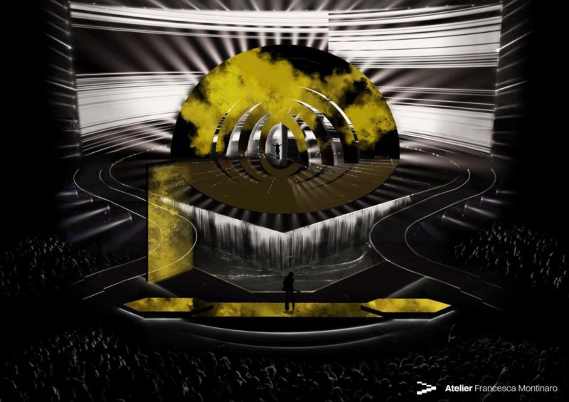
a waterfall though? idk
a waterfall though? idk
apasionata
Veteran
Yeah same. So we'll have a water fountain on during performances or..?a waterfall though? idk
DanielLuis
Well-known member
- Joined
- March 14, 2011
- Posts
- 8,605
Hopefully they'll be able to get all the elements working as planned in May, because the idea is excellent
apasionata
Veteran
1979 teas. Loves it


The stage design and concept looks soo good. I especially love the water feature, it was one of my favourite things about 2014 but they didn't really use it a huge amount. The Italian Garden for the greenroom as well.  Looove it. It's all really starting to get exciting.
I love the design: It's a little bit unconventional after several of Florian Wieder's designs. The rotating sun and the waterfall feature offers a lot of unique stagings for 41 songs and seems more versatile than Rotterdam '21 or Kyiv '17 IMO. If I have to be nitpicky, I wonder why the island needs to have hexagons on it.
However, I'm also concerned about how ambitious the design looks.
1. The bridges seem pretty hazardous since it slopes down while curving. Will they install railings on them?
2. The strength of the overall structure, since the prototype's floor material looks so thin. Even if they're not LED, it's still concerning.
3. The waterfall. I hope they can find a way to make the water circulate. The designers look like they've considered this on the design, however.
Chorizo
Well-known member
- Joined
- May 9, 2014
- Posts
- 4,346
The renderings of the stage look very promising. This year will provide a welcome change from the usual Wieder stage.
You can see that Eurovision is a lot more important to RAI these days than in 1991.
The logo also looks tastefully done. The motto is appropriate and not quite as random and questionable as some of the mottoes in previous years.
You can see that Eurovision is a lot more important to RAI these days than in 1991.
The logo also looks tastefully done. The motto is appropriate and not quite as random and questionable as some of the mottoes in previous years.
Lance Esgard
Well-known member
The garden for a Green Room particularly interests me, as the Green Room area has tended to be an afterthought.
Miss Antartica
Active member
- Joined
- January 9, 2022
- Posts
- 252
the secon city in the postcard is Merano-Meran near to the border with Austria


Ezio
Veteran
The Rotterdam stage experience was really kinda bland. The LED screen and stage floor were flatter than the Netherlands themselves, but overall it didn't feel genuinely dutch. I would have added rotating hands of a windmill to make it look more interesting. Also the addition of water for some below-sealevel look an d feel, was a missed opportunity.
tuesday, in turin, they begin to build the scenography
Nice, I hope we'll get some insider shots!
Miss Antartica
Active member
- Joined
- January 9, 2022
- Posts
- 252
Today the stage realisation, but nothing news about this.
midnightsun
Veteran
The Rotterdam stage experience was really kinda bland. The LED screen and stage floor were flatter than the Netherlands themselves, but overall it didn't feel genuinely dutch. I would have added rotating hands of a windmill to make it look more interesting. Also the addition of water for some below-sealevel look an d feel, was a missed opportunity.
I miss the good old days where everything on the GF was related to the host country. Or at least a part. Staging 1991 Rome, Collosseum. Sweden 1992, Viking boat.
Or my alltime favourite: 1994, City skyline. Even the postcards are becoming more meh. They try to come up with funny ideas but I preferred simple picture postcards in which we could see some parts of the host country. I don’t need to see the artists doing whatever crazy stuff.
Miss Antartica
Active member
- Joined
- January 9, 2022
- Posts
- 252
Ravenna city confirmed in the postacards


Miss Antartica
Active member
- Joined
- January 9, 2022
- Posts
- 252

