- Forum
- HISTORY & FUTURE
- Lugano 1956 - Rotterdam 2021
- ESC 2018 - Song, Artist, NF Discussions
- Salvador's Saloon
So what will the hosting be like?
- Thread starter Fluke
- Start date
- Watchers 5
lavieenrose
Albania Superstar
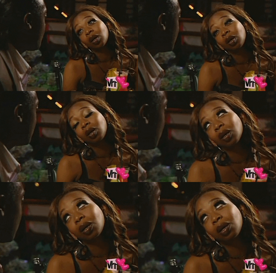
Guys, I am sure that 1, 2 or maybe even the 3 of the hosts is in this photo. Possibly even more if you consider other events like the Allocation Draw or the Opening Ceremony!

Wait, are these the people who did the "porca puttana" interview? I'm so down if so

JonnyWest
Member
Wait, are these the people who did the "porca puttana" interview?
Yes

SaladBreak
Well-known member
- Joined
- January 9, 2016
- Posts
- 3,506
Joao Paulo Sousa would be a great host 
I wish Petra were hosting once again along with Mans.
I really don't understand the love for Petra... I guess is an esc bubble thing...
I really don't understand the love for Petra... I guess is an esc bubble thing...
Well... I have to say that she was really hilarious and so gentle towards people when she hosted twice. This is only my opinion, not Eurofans' one. I don't need anyone to tell me what to state nor assume regarding my thought.
anto475
Well-known member
QwaarJet
ESC Moderator
I really don't understand the love for Petra... I guess is an esc bubble thing...
No, the general public loved her as well.
A-lister
Veteran
- Joined
- December 28, 2009
- Posts
- 32,825
I really don't understand the love for Petra... I guess is an esc bubble thing...
ESC bubble? She's probably the best hostess Sweden has to offer and certainly one of the best hostess ESC ever had, in particular the last decade or so...
Not an "ESC bubble" thing...
Ezio
Veteran
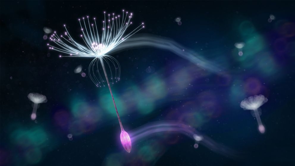
I really hope to see a fresh captivating design and different colours. The last 3 years really were bland in the design department. I am so done with these spheres, beads, dandelions, pearls, and I would love to see something different and not necessarily something geometric. For me geometric shapes are very unwelcoming.
Colourwise, I like to see the Portuguese colours, which look very expensive and royal, but also quite warm and friendly. Gold, green and dark red would be a break from the common purple, blue and teal of recent years.
The scoreboard could use a make-over as well. Recently it got very boring. I know it is about numbers, but we do not have to be reminded of Microsoft Excel too much. I like it when it plays with maps. Why was the stunning scoreboard of Oslo 1996 never redone?
My favourite slogan for 2018 would be Salvador's own words "Music is Feeling".

But I would have also loved to see something that included "unstoppable" in 2015, and it didn't happen.
Colourwise, I like to see the Portuguese colours, which look very expensive and royal, but also quite warm and friendly. Gold, green and dark red would be a break from the common purple, blue and teal of recent years.
The scoreboard could use a make-over as well. Recently it got very boring. I know it is about numbers, but we do not have to be reminded of Microsoft Excel too much. I like it when it plays with maps. Why was the stunning scoreboard of Oslo 1996 never redone?
My favourite slogan for 2018 would be Salvador's own words "Music is Feeling".


But I would have also loved to see something that included "unstoppable" in 2015, and it didn't happen.
I really hope to see a fresh captivating design and different colours. The last 3 years really were bland in the design department. I am so done with these spheres, beads, dandelions, pearls, and I would love to see something different and not necessarily something geometric. For me geometric shapes are very unwelcoming.
Colourwise, I like to see the Portuguese colours, which look very expensive and royal, but also quite warm and friendly. Gold, green and dark red would be a break from the common purple, blue and teal of recent years.
The scoreboard could use a make-over as well. Recently it got very boring. I know it is about numbers, but we do not have to be reminded of Microsoft Excel too much. I like it when it plays with maps. Why was the stunning scoreboard of Oslo 1996 never redone?
My favourite slogan for 2018 would be Salvador's own words "Music is Feeling".
But I would have also loved to see something that included "unstoppable" in 2015, and it didn't happen.
I would be careful with the portuguese colours. It could very easily look like christmas
I still thing they should have used this as the main logo in 2016 btw

Ezio
Veteran
I would be careful with the portuguese colours. It could very easily look like christmas

The flag icons:


I still thing they should have used this as the main logo in 2016 btw

Yes, much better. The actual logo looked like a virus under a microscope.
anto475
Well-known member
https://www.reddit.com/r/eurovision/comments/7tt2mz/mena_where_is_portugal/ This is my absolute favourite video so far. Can we just get rid of the other three and have Filomena hosting it all?
Ezio
Veteran
"bitch please we are already allocated"
Ezio
Veteran
Filomena is phenomenal, the blondie is cute and clumsy. I loved how her ring rang quite a noise, everytime she drew a ticket from the pot.
These ladies rock!
These ladies rock!
FilipFromSweden
Well-known member
- Joined
- March 27, 2012
- Posts
- 6,667
I am so impressed by everything I've seen so far by RTP, I have a feeling it's going to be a great year!


