Back in december the EBU announced that they were going to tweak up the logo from the cancelled 2020 edition for the Eurovision Song Contest in 2021. It still payed an homage to the original design but focussed more on the connecting element of the contest. The EBU now gives us some examples how the new logo could be used in their communication. Let’s find out what kind of ideas they have!
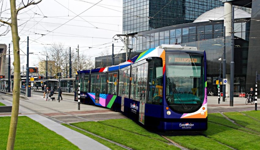
First of all, the new data drive logo was designed again by CLEVER°FRANKE. They were also responsible for the logo last year. They joined forces with NEP and MediaMonks to add a new systeem so the design will come alive. Going to the venue with an Eurovision tram? It will be possible in May thanks to this team! Also the merchandise of this year’s edition will be fully inspired by the logo.

As you can see in the shirt above, the logo got a new feature. It’s called “The track” and it expands the flag-cloured beams to create a forever repeating track. This symbolize the theme of this year’s event: The track keeps “opening up.” It’s based on the symbol and perspective of the stage design, which was created by Florian Wieder last year.

If we zoom in closer on The Track, we see different patterns on the different colour strokes. These abstract patterns symbolize 6 keywords that celebrates The Netherlands: landscapes, water, bridges, fields, creativity and resilience. We can see this patterns also used in backgrounds.

What do #YOU think of the new possibilities of the logo? Share your thoughts with us on our forum HERE or join the discussion below and on social media!


 Austria Wins Eurovision 2025!


