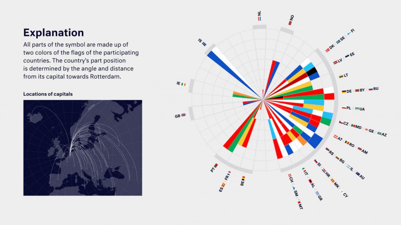
The EBU has today announced that the logo for Eurovision 2021 will be slightly different to what we were expecting, with the colourful circular design from the cancelled 2020 contest breaking out for Rotterdam 2021!
In a video explaining the amendment to the contest’s branding, the EBU identified that “last year’s artwork was about our [Eurovision’s] legacy, telling the story of looking back”, with the new artwork “telling a story about where we are going”
The logo now depicts the contest centering on Rotterdam with a visual representation of the distance of each of Europe’s capital cities from the Dutch host city of Eurovision 2021. Executive Producer of the 2021 contest, Sietse Bakker, explains that “the logo connects Rotterdam with the capitals” and “symbolises coming together, regardless of the form”.

More details of the vision behind the new artwork can be found on Eurovision.tv. Make sure to vote in our poll below and let us know your thoughts on the branding for Eurovision 2021!
What do #YOU think of the new logo?
[Total_Soft_Poll id=”2″]
Share your thoughts with us on our forum HERE or join the discussion below and on social media!


